 Figma
Figma Claude Code
 Netlify
I mapped the service, then ran the journey myself
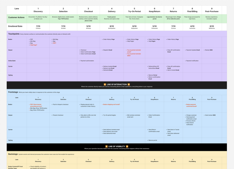
I mapped it end to end
I blueprinted the journey first — nine stages, five organisations, front and backstage. Confidence drops at exactly the two points the customer can see nothing — checkout, and the final charge. And most of what happens to them is triggered by a system nobody at Boden owns.
Then I became a customer
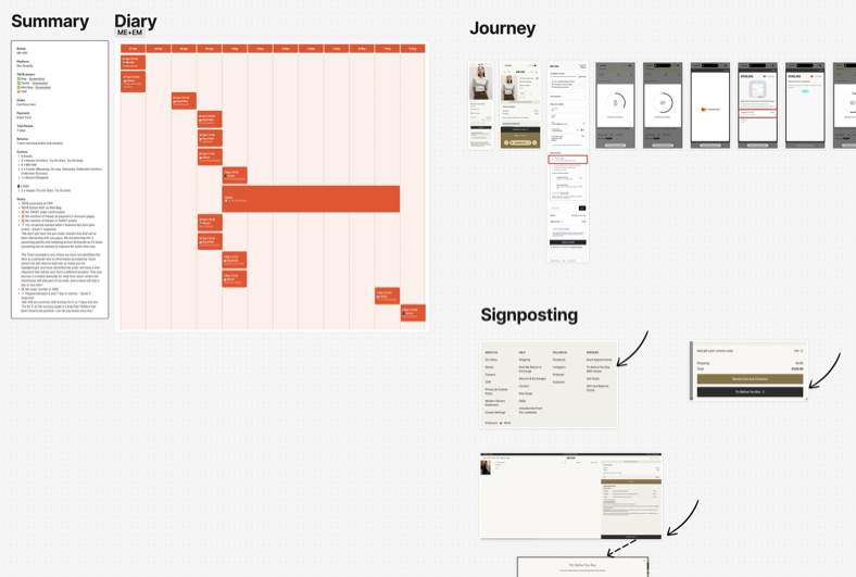
The service already ran for other retailers, so I placed real orders through one of them — my own money — and logged every message for the whole trial. It turned up problems before any Boden customer would have hit them.
- The service partner is never named on the confirmation, in account pages or in the emails — the first you hear of them is when they take your money.
- A £1 authorisation charge with no warning that it is coming.
- "Refund" used for money that had never been taken.
"Who is Harper? I thought this was Boden." — the exact gap those orders had already predicted.
What I tried first
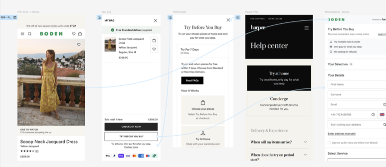
A Figma prototype per channel
Brittle. Linked prototypes at this scale break in ways that are easy to ship into a session — one change could take it down mid-study.
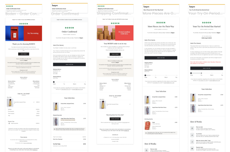
Test each message on its own
Every email reviewed in isolation. They all read fine that way — which was never the question. What we needed to know was whether someone four days in could tell what had happened and what was coming.
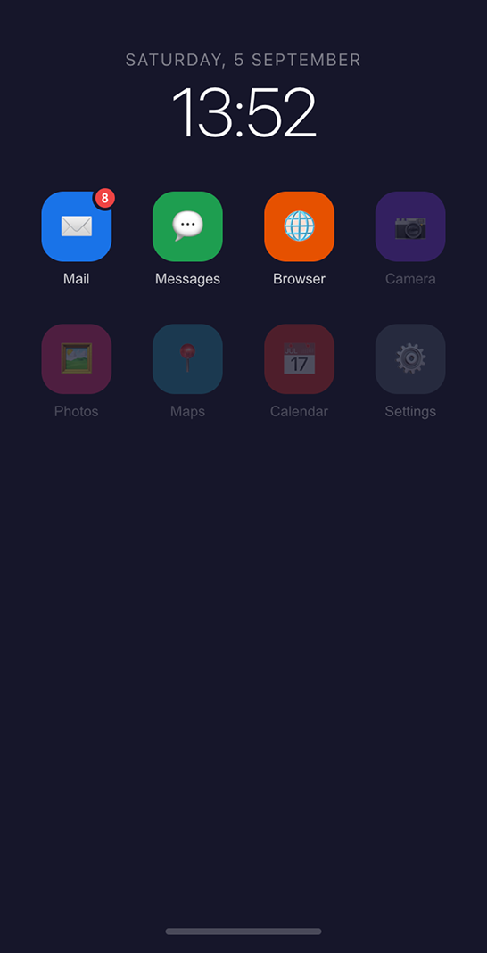
A device that isn't a phone
One coded simulator, home screen, three working apps. OS-agnostic on purpose — so nobody is really reacting to someone else's operating system.
What the prototype had to do
I specced it with our UX Researcher: half the list is what the study had to cover, half is what a facilitator needs in the room. Code rather than Figma meant changes were quick, safe and version-controlled — so we could always answer the question that quietly ruins qualitative research: which version did this participant see?
- OS-agnostic — familiar enough that nobody was thinking about the device.
- Notifications that fire on action, not on a timer.
- A way to skip forward in time, so a seven-day journey fits inside an hour.
- An admin panel to jump to any stage without working through everything before it — a facilitator ask, and the feature they used most.
- Auto-fill disabled, so nobody revealed their own address or card details to an observer.
What we found, and what shipped
The problems were not where the service was complicated. They were where it was unfamiliar.
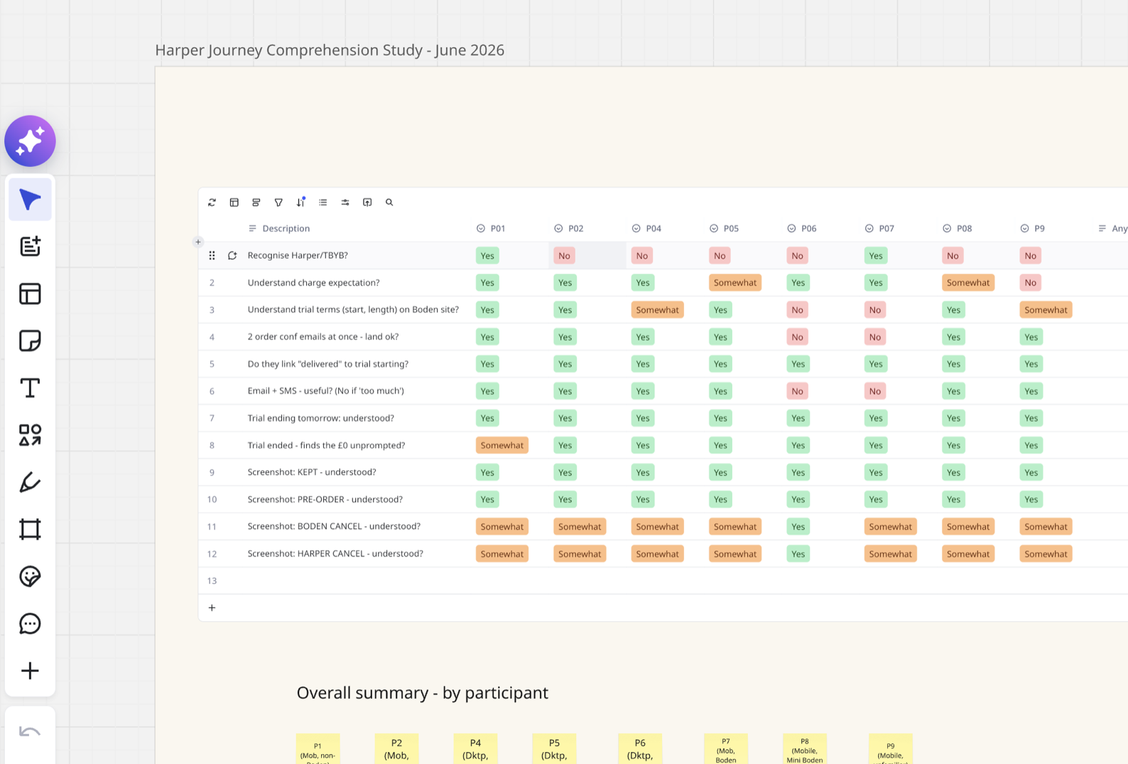
An email from a company they had never bought from read as a scam. We introduced the partner in Boden's own order confirmation — named as our trusted partner, with the exact address their email would come from — so the first contact was expected instead of alarming.
“Just add a button to the mini bag”
It sounds like a small ask, and everyone agreed it was. But space in the mini bag is at a premium — everything in it has to earn its place — and it is the last thing a customer sees before deciding whether to go through with an order. It is a fixed height, and the OS and browser take a slice of that before the page gets any of it — the status bar at the top, the address bar at the bottom. So rather than add the button, I worked out what it would cost first.
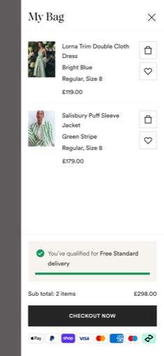
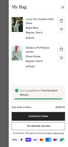
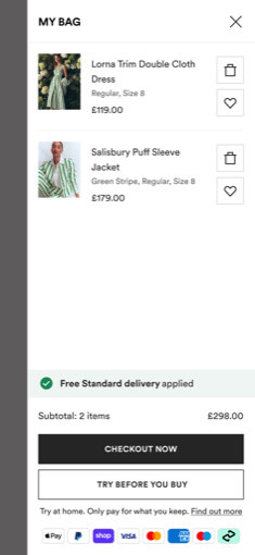
The products are what the panel is for, so that is what I protected. Everything around them gave a little instead — and where I did touch a product, it was to let the name and the price come forward.
- Heading reset in our new heading face. It holds the same presence at less size, so the padding around it could come down too — height off the top of the panel without losing the balance.
- Colour and size dropped to the secondary text colour, and down a size. They sit below the product title and the price in importance, and were being set as though they didn't.
- Delivery threshold banner scaled back. Smaller, progress bar removed — but switched to our success green, so what survived still reads as good news rather than just less of it.
- Bottom padding under the payment marks cut. Worth a few pixels on its own; worth having when there is this little to go round.
The button went in. The panel came out of it with more room for products than it had before anyone asked for one.
Research prioritised the two rounds, the BAs turned that into requirements both teams could build from, and I worked with the developers through the build. The service launched on schedule, with the problems we found already fixed.
Customers never met any of it.
Everything we found was fixed before launch, rather than reported afterwards by someone it had already happened to.
We came out of it with a foundation, not just a prototype.
Because it is configured rather than rebuilt, the next cross-channel study starts from something that already works.
The reference Customer Service now uses
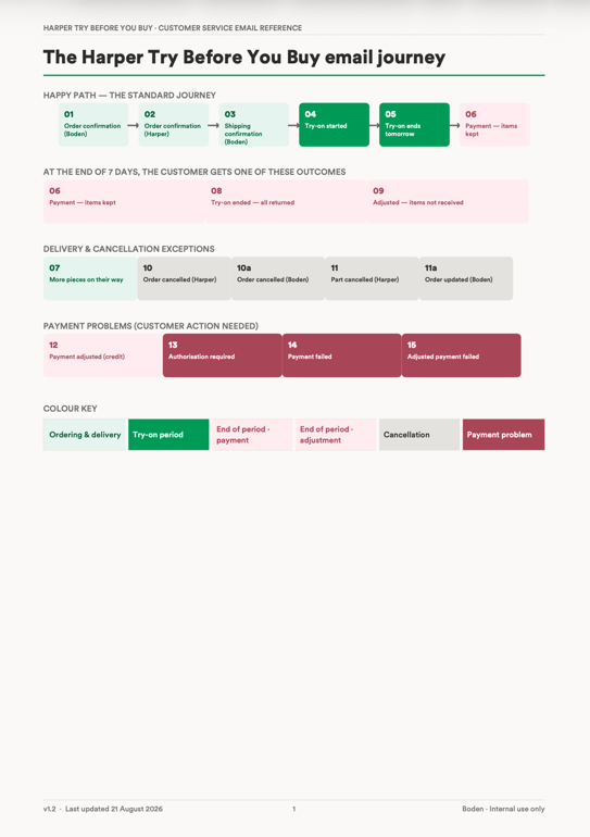
Demoing the journey to the Customer Service team made something obvious: there were far more messages in this service than anyone on a call could hold in their head, and an agent hearing "I got an email saying…" had no way to place which one, or where it put that customer in their trial.
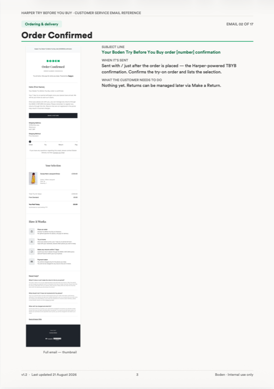
Nobody asked me to solve that. But building the prototype had already left me with every message in sequence, so I turned it into a reference they could work from — the flow end to end, with a visual of each of the seventeen emails beside it.